Are you looking to turn more visitors into customers? A well-optimized landing page is your secret weapon. Welcome to our comprehensive guide on landing page optimization, where we’ll walk you through a powerful checklist to supercharge your conversions.
Landing pages are the unsung heroes of digital marketing. They’re often the first impression potential customers have of your product or service. But here’s the catch: you only have seconds to make that impression count. That’s why mastering landing page best practices is crucial for your online success.
In this post, we’re diving deep into landing page optimization. We’ve distilled years of experience and data into a practical, easy-to-follow landing page optimization checklist. Whether you’re a seasoned marketer or just starting out, these strategies will help you create pages that not only look great but convert like crazy.
Ready to transform your landing pages from good to great? Let’s dive in and explore the 12 essential steps that will take your landing page game to the next level.
1. Your Value Proposition: Make it Pop!
When it comes to landing page optimization, your value proposition is the star of the show. It’s the first thing visitors see, and it can make or break their decision to stick around. Let’s break down how to create a value proposition that truly pops:
- Keep it short and sweet: Your value proposition should be quick to read and easy to grasp. Aim for a sentence or two at most. Think of it as the headline of your landing page – it needs to grab attention fast.
- Use everyday language: Forget about industry jargon or fancy words. Write as if you’re explaining your product or service to a friend over coffee. The easier it is to understand, the more likely visitors are to connect with it.
- Focus on benefits: Don’t just list features. Instead, highlight how your offering solves problems or improves lives. What’s the real value you’re bringing to the table? That’s what visitors want to know.
- Be unique: In a sea of similar products or services, what makes yours special? Highlight your unique selling points. This could be superior quality, innovative features, exceptional service, or anything that sets you apart from competitors.
Remember, a strong value proposition is a key element of landing page optimization. It’s your chance to make a great first impression and convince visitors that they’re in the right place. Take the time to craft it carefully, and you’ll see the difference in your conversion rates.
2. Mobile-Friendly? More Like Mobile-First!

In today’s world of landing page optimization, thinking mobile-first isn’t just smart – it’s essential. Here’s why making your landing page mobile-friendly should be at the top of your checklist:
- Responsive design is key: Your landing page should look great on all devices, from the smallest smartphone to the largest desktop monitor. This means text that’s easy to read, images that resize properly, and layouts that adjust smoothly.
- Speed matters: Mobile users are often on-the-go and have little patience for slow-loading pages. Aim to have your page load in 3 seconds or less. This might mean compressing images, minimizing code, and leveraging browser caching.
- Make it easy to tap: Remember, mobile users navigate with their fingers, not a precise mouse cursor. Make buttons and links large enough to tap easily. A good rule of thumb (pun intended) is to make clickable elements at least 44 pixels wide and tall.
- Simplify your content: On smaller screens, you have less real estate to work with. Focus on the most important elements of your message. Use concise text, clear headings, and only the most relevant images.
By prioritizing mobile optimization, you’re not just improving your landing page – you’re meeting your audience where they are. This approach can significantly boost your conversion rates and overall user experience.
Remember, in the realm of landing page optimization, mobile-friendly isn’t just a nice-to-have anymore. It’s a must-have for success in our smartphone-dominated world.
3. Pictures Worth a Thousand Clicks

When it comes to landing page optimization, visuals play a crucial role. In 2024, the right images can be the difference between a visitor bouncing and converting. Here’s how to make your visuals count:
- Show, don’t just tell: Use images or videos that demonstrate your product or service in action. This helps visitors quickly understand what you’re offering and how it might fit into their lives.
- Tap into emotions: Choose visuals that resonate with your audience on an emotional level. Whether it’s joy, relief, or aspiration, the right image can create an instant connection.
- Prioritize quality: High-resolution, professional-looking images are a must. Low-quality visuals can undermine your credibility and make your offering seem less valuable.
- Diversify your visuals: Don’t limit yourself to static images. Consider using infographics to present data, short videos to tell your story, or even GIFs to add a touch of personality.
Remember, as part of your landing page optimization checklist, your visuals should work hand-in-hand with your copy to convey your message. They should enhance, not distract from, your core value proposition.
By following these landing page best practices for visuals, you’re not just making your page look pretty – you’re creating a more engaging, persuasive experience for your visitors. This can lead to higher conversion rates and better overall performance of your landing page.
4. Trust Me, I'm a Landing Page

Let’s face it – the internet can be a pretty sketchy place. So when someone lands on your page, they might be a bit wary. Your job? Make them feel like they’re in good hands. Here’s how to build trust and get those conversions rolling:
- Showcase your fans: Nothing beats word-of-mouth, even in the digital world. Sprinkle in some genuine testimonials from happy customers. And if you can, add their photos or social media handles. It makes the praise feel more real and relatable.
- Flash those badges: Got any certifications, awards, or security seals? Don’t hide them in a drawer! Display them proudly on your landing page. They’re like little stamps of approval that tell visitors, “Hey, we’re legit!”
- Name-drop (tastefully): Been featured in well-known publications or media outlets? Don’t be shy about it. A “As seen in…” section can give you an instant credibility boost. It’s like having a celebrity endorsement for your brand.
- Play the numbers game: If you’ve got impressive stats, flaunt ’em. Whether it’s the number of satisfied customers, years in business, or products sold – big numbers can be seriously persuasive. They show you’re not just another fly-by-night operation.
Remember, building trust isn’t about bragging. It’s about showing potential customers that others have taken a chance on you and been glad they did. When you nail this part of your landing page, you’re not just optimizing – you’re creating a comfort zone where visitors feel good about taking that next step.
5. Call-to-Action: Make it Irresistible

Your CTA is where the magic happens. It should be so clear and compelling that visitors can’t help but click. Here’s how:
- Use action words: “Get,” “Start,” “Discover” – make it exciting!
- Stand out: Your CTA should pop off the page. Think contrasting colors.
- Location, location, location: Put it where people can’t miss it.
- What’s next?: Be clear about what happens after they click.
6. Forms: Keep 'em Short and Sweet
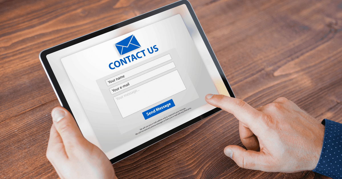
Nobody likes filling out forms. Make it as painless as possible:
- Ask only what you need: Name, email, done. Get the rest later.
- Smart forms: Use tech that remembers returning visitors.
- Break it up: If you must ask for more, spread it across multiple steps.
- Instant feedback: Let people know right away if they’ve made a mistake.
7. Get Personal (But Not Creepy)

Personalization is great, but there’s a fine line between helpful and stalker-ish. Here’s how to do it right:
- Use their name: If you’ve got it, use it (but don’t overdo it).
- Location, location, location: Tailor content based on where they are.
- Remember me?: Acknowledge returning visitors.
- Custom recommendations: Show them stuff they’re likely to love based on their behavior.
8. Speed Demons Only

Slow pages are conversion killers. Here’s how to speed things up:
- Optimize images: Compress ’em without making them look awful.
- Minimize code: Clean up your HTML, CSS, and JavaScript.
- Use a CDN: It’s like having a clone of your site closer to your visitors.
- Test, test, test: Use tools like Google PageSpeed Insights to check your speed regularly.
9. Chat It Up
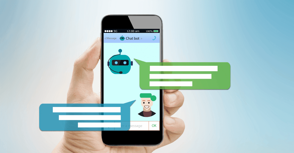
AI chatbots have come a long way. They can be your 24/7 sales assistant:
- Answer FAQs: Let the bot handle the easy stuff.
- Guide visitors: Help people find what they’re looking for.
- Collect info: Gather lead data without being pushy.
- Always available: Because sleep is for humans, not websites.
10. Stay on Brand

Your landing page should feel like a natural extension of your ad or email. Keep things consistent:
- Match your message: If your ad promised a free trial, your landing page better deliver.
- Visual continuity: Use similar colors, fonts, and imagery.
- Tone of voice: If your brand is playful, your landing page shouldn’t sound like a legal document.
11. Create Some FOMO

Fear of Missing Out is real. Use it (ethically) to your advantage:
- Limited time offers: But only if they’re genuinely limited.
- Low stock warnings: If you’re running out, let people know.
- Exclusive deals: Make your visitors feel special.
Remember, honesty is key. Don’t fake scarcity – it’ll backfire.
12. Test, Tweak, Repeat

The work’s never done, folks. Keep improving:
- A/B test everything: Headlines, images, CTAs – test ’em all.
- Watch and learn: Use heat maps to see where people are clicking (or not).
- Ask for feedback: Sometimes the best way to know what’s working is to ask your visitors.
Wrapping It Up
There you have it – your guide to landing page best practices for 2024. Remember, these aren’t hard and fast rules. Every audience is different, so what works for one might flop for another. The key is to keep testing, learning, and improving.
Your perfect landing page is out there. It might take some time to find it, but with these tips and a bit of patience, you’ll get there. So go on, give your landing pages some love. Your future customers (and your bottom line) will thank you!
Now over to you. What landing page tricks have worked for you? Any epic fails you’ve learned from? Share your stories in the comments – we’re all in this together!

